How to select the right paint color
Happy new year! I hope everyone enjoyed the holidays and is feeling refreshed, motivated and ready to tackle 2023 with open hearts and positive mindsets. If you want to start the year off by redecorating a space in your home, one of the most impactful and cost effective ways to do that is a fresh coat of paint. But choosing paint can be an intimidating task so I thought I’d kick things off on the blog this year by giving you a detailed guide on where to start, what to consider and hopefully help you narrow down the choices.
furniture first
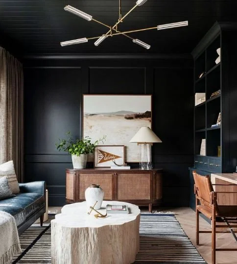
Imagine you just bought a house and you’re ready to design the living room. First thing to choose is paint, right? I used to think the same. But actually, a good designer will choose the furniture, art, rugs, and decor first and then choose a paint color.
Why? It’s actually easier to choose a paint color by looking at the tones of wood in your furniture, or pulling a color out of your favorite painting or rug than to just choose a color at random. This strategy not only gives you a little bit of direction but also helps tie the room together and can help make certain elements pop.
Photo Credit: Jean Stoffer Design
Photo Credit: Studio McGee
Photo from: The Spruce
For my clients, I always start by organizing images of the furniture pieces, rugs and art in a mood board in a program called Canva (which has a free version that is great if you’re just getting started!). Insert images from any new pieces you’re buying online, that you found in stores or current pieces you already own that you want to incorporate. Then you can see how it all comes together and what colors to consider. Once you’ve narrowed it down you can upload the paint color to the background to give you an idea of what it would look like on the walls.
Top left: Tate Olive by Benjamin Moore; Top right: Cracked Pepper by Behr; Bottom left: Redend Point by Sherwin Williams (2023 Color of the Year); Bottom right: Modern Gray by Sherwin Williams
match the mood
These days with customization and paint matching there are literally thousands, maybe millions of paint colors available to you - talk about overwhelming. But when you boil it down, there are really only 7 true tones: red, orange, yellow, green, blue, indigo, and violet (or how we all remember it, Roy G Biv).
In color theory, each of these colors is associated with feelings and can actually inspire our mood when we are in a room. For example, blue is associated with calmness and tranquility so is often used in bedrooms for better sleep. So think about the room you are about to paint and the feeling you want to have when you’re in it. Do you want to feel fun and sexy? Moody and mysterious? Fresh and lively? Here is a quick color guide for you to follow:
Undertones
Now that you’ve decided on the mood, the next thing to consider are the undertones, Undertones are the sneaky colors that maybe you didn’t notice in a tiny paint sample but then shine through when spread across an entire wall or room. Let’s say you want a light gray but the room turns out looking kind of blue. Or you’re going for white and it looks a little yellow.
The easiest way to tell the undertones of a color are by holding the entire paint swatch and looking at the color on the bottom, typically the darkest. Let’s go back to our example of wanting to paint a room gray. Here are 3 different grays from Sherwin Williams:
At first glance, these all may just look like grey but when we look at the entire paint swatch we can see a clear difference. Modern Grey has brown undertones whereas Guild Grey and Windchill will both come out looking more blue on your walls.
direction Matters
Natural light impacts the look of a color almost more than anything else. So before making a selection, consider which directions the windows are facing and how much light the room receives. For example, a room in the woods surrounded by trees will receive less light than a house along the beach. North, South, East and West all have distinct lighting characteristics, explained here by color experts at Benjamin Moore:
North facing rooms:
Tend to get consistent light throughout the day
The natural light can be muted and toned down
Cool, blue-gray tones are common
Neutral paint color suggestions: Cotton Balls, Pale Oak, or Elephant Tusk
South facing rooms:
Tend to get consistent natural light throughout the day
Natural light tends to be strong
Lighting often casts a warmer tone
Neutral Paint Suggestions: Decorator’s White, Horizon, Wind’s Breath
East facing rooms:
More direct light in the morning, and muted, indirect light past noon
Natural light tends to be a cooler cast
Neutral paint suggestions: Simply White, Balboa Mist, or Manchester Tan
West facing rooms:
More indirect and somewhat muted light in the morning, and stronger direct light past noon
The natural light tends to be a warmer cast
Amber tones are common for light that comes from the west.
Neutral paint suggestions: White Heron, Moonshine, or Ashwood


